Showing posts with label Spritzer bottle. Show all posts

Tuesday, January 12, 2016

Happy Colors

Hello, Diane with you today.  How is the weather where you live?  It is cold here, in the teens, so it seems appropriate to bring a bit of sunshine to the blog in the form of bright and happy colors.

Our challenge this week just so happens to be Bright and Cheerful.  Nothing can produce those colors like the Ken Oliver Color Bursts.  I used colors from both the Earth Tone Set and the Brights Set.  Using the Spritzer Bottle, I spritzed water on water color paper, then lightly squirted on the colors, more water, etc., until I was satisfied with the results.


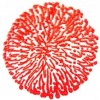
Here is a photo to show you the effects.  (Yes, I did a second one for later use.)

Once dried, I cut flowers and leaves from Spellbinders Romantic Blooms Three.  Black Pearls were added to the center of the larger flower.


For the background I used one of the dies from Memory Box Distressed Windham Collection.  Then I embossed it with Crafts-Too Dots embossing folder.

I finished with a pretty bow with ribbon from Really Reasonable Ribbons.  Thank you for visiting with me today!

Don't forget to check out the NEW section at Classy Cards 'n Such. Lots of new products! When you check out, don't forget to enter your blog discount (coupon code BLOG10) for a great savings! 

Thanks for stopping by!!!   Until next time...


Pin It

Tuesday, October 13, 2015

Autumn Sky

Happy Tuesday to you! Diane with you today and I have to tell you, I am very excited about this card! I love how it turned out!

This was created for our current challenge we have this week, which is Colors of Fall! As soon as I saw the inspiration photo, it just screamed Ken Oliver Color Bursts at me!


There are several techniques to use Color Burst, my favorite so far is how I did this card.

Using the smoother side of water color paper, I used an Empty Spritzer Bottle to saturate it with water. Then using 3 colors of Color Burst, (starting with the lightest to the darkest): Lemon Yellow, Orange, and Terre Verte, I puffed the colors on the water.

By puffing I mean, I shake the bottle (with lid on of course) upside down, open, then just lightly squeeze (puff) onto the paper/water.

A little bit goes a long way, so be careful. If you get spots of color, just spray with more water until you are satisfied with the colors. You can always add more water, but not remove the color!

I heat set my colors so I could continue on with my card,
but you can set it aside and just let it air dry if you prefer. I cut a few Impression Obsession Birch Trees, which I then rubbed a bit of grey ink on.

I cut a fox from Poppystamps Fine Foxes, colored him, then adhered him to the card.


Last I used a piece of Heavyweight Vellum, ran the Anti- Static Bag across it, used VersaMark ink on Impression Obsession Autumn Leaves stamp set, then sprinkled Apricot embossing powder on. Heat set and I had a pretty fall card!

I wanted to mention that the color bursts can be bought single or in a set, whichever you prefer. I purchased my first 2 colors just so I could try them out. It wasn't long before I bought both the EarthTone set and completed my Brights set. In fact I love this stuff so well, I am now friends with Ken Oliver on Facebook..LOL!

Thank you for visiting with me today!


If you are unable to find an item in the store, or would like something special ordered, please email me at beverly@classycardsnsuch.com.

Thanks for stopping by!!! Until next time...


Pin It

Monday, October 12, 2015

The Still Woods

Hello!  Diana here with a very fall card for this week's Colors of Fall challenge. The best thing about fall are the gorgeous colors (and warm drinks, sweaters, cool air, apple picking). Yep, I love fall.


To make my fall color card, I started with the Memory Box Garden Birch Trees stencil taped to white card stock. I then masked off a curved piece of copy paper and sponged in some hills. I then sponged the rest of the card with Squeezed Lemonade. 

Next, I covered the hills and misted my paper with a Spritzer Bottle. I then added my color bursts Alizarin Crimson, Orange, Lemon Yellow, Pthalo Green.

So that it would look like individual leaves, I did not squeeze my bottles but just shook it out onto my stenciled paper. I wanted individual drops of color and not too much blending. Because I had already sponged the background yellow, I wasn't worried about covering up any white with the color bursts.

I then cut out the birch scene with Spellbinders A2 Matting Basics A, and then also some green card stock with the largest die, to have a double mat against my Kraft base layer.

Though I hesitated to cover up my background, I did just enough to be able to see that it was a wooded background. I used two of the dies from the ODBD Vintage Flourish Pattern for my focal point.

By using Vellum as one of my matting layers, I was able to have a mat for my Scripture stamp, and yet still see my background. The verse was done with White Detail embossing powder and then I added a twine bow.

Thank you so much for looking and I hope you get a chance to play along!


Don't forget to check out the NEW section at Classy Cards 'n Such. Release from 2015 collections are being added every day! When you check out, don't forget to enter your discount for a great savings!

Thanks for stopping by!!! Until next time...


Pin It

Thursday, September 10, 2015

You Are Beautiful

Hello, it's Diana again with a combination of my favorites: watercolors and butterflies. This card came together very quickly - after I had messed up a couple of previous attempts. I just made it too difficult! To make the easier (and prettier) version, read on!

I started with a sheet of watercolor paper, trimmed down with the large stitched die from MFT Blueprints 13. Apparently I am trying to see how long this particular die will last - if you've noticed how often I start my cards with this particular step! It still works beautifully by the way!

I then spritzed a very generous amount with my handy dandy Spritzer Bottle. I had already activated my Twinkling H2O's Thankful set from my previous attempts. I then added some with a brush in the approximate area of where each butterfly would be and let it spread on its own. It blended beautifully, and I am always freshly amazed at how shimmery it is.
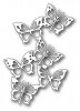
I set it aside to dry and die cut two sets of the Memory Box Fairyland Butterflies - once in black once in white. I glued the two of them together first - offsetting the black just a bit for a shadow effect with Art Institute Dries Clear Adhesive.

Once the watercolor was dry, I went back and splattered a few drops of water to remove some of pigment - another great trick to give it a nice organic watercolor look.  I then glued the butterflies.

Since the butterflies took up most of the space, to add my sentiment, I stamped in blue pigment ink and then used Clear Detail embossing powder on Vellum and wrapped it around the watercolor layer. I always use Scor-tape to adhere the watercolor paper to the base layer because it is so thick and usually a little bit warped. The stronger the adhesive the better - or it might just pop up a corner after a day or two!  I also added some Clear and Water Dew Drops...really going with the water theme today!


Click any of the links below to be taken to the products from the Classy Cards 'n Such shop.

Thanks for stopping by!!! Until next time...


Pin It